In 2015, I researched and wrote about the risk to industrial society from geomagnetic storms—terrestrial phenomena that, despite their name, originate on the sun. Mild storms give us the ineffable beauty of the Northern Lights, and the Southern Lights too. Severe geomagnetic maelstroms might, some fear, knock out key satellites or cause continent-wide blackouts that would take months to undo.
I concluded that the risk had been exaggerated in the studies that gained the most attention. Still, given the potential stakes and the historical neglect of the problem, the issue deserved more attention from people in science, business, and government.
As I wrapped up my investigation, I tripped on a question of statistical method that I did not have time to fully explore. I have since put more time into the question. I just finalized a working paper about the results and submitted it to a journal. The upshot for the geomagnetic storm investigation is that I have modified my methods for extrapolating storm risks from the historical record. As a result, I have raised my best estimate of the chance of a really big storm, like the storied one of 1859, from 0.33% to 0.70% per decade. And I have expanded my 95% confidence interval for this estimate from 0.0–4.0% to 0.0–11.6% per decade.
More explanation follows.
As I sought to come to terms with the problematique of geomagnetic storm risk, one tack I took was statistical. What can we infer from our limited record of the past about the odds of a big storm in the future? The estimate most popularly cited comes from an astronomer named Peter Riley. In 2012, he calculated that the chance of another storm as big the “Carrington event” of 1859—which spread sent auroras as far south as Havana—is 12% per decade. If such a geomagnetic tempest, repeated tomorrow, could shut down industrial economies, then a 12% risk is serious.
As is my wont, I decided to analyze the data myself, using a branch of statistics called extreme value theory. I concluded that Riley’s is “an unrepresentative extrapolation from history,” mainly because it assumes from the start that magnetic storms obey a power law. The power law distribution is “fat-tailed,” meaning that extreme events happen relatively often. In fact, I find, the data favor the exponential distribution, whose tail is much thinner. I estimated the chance of another Carrington at just 0.33%/decade.
Yet I placed a wide uncertainty interval around that number. My margins of error reached from 0.0% to 4.0%. And the higher number was still worth worrying about.
But I also harbored uncertainty about how I had estimated my uncertainty. The problem is this: most statistical theory assumes that data samples are large. Certain mathematical patterns, such as the bell curve, emerge clearly as the number of data points increases. And assuming that your data set is large enough for such regularities to set in makes the work of statisticians much more tractable. But when studying extreme events, the data sets are often small, almost by definition. Modern magnetic observatories have only been operating long enough to capture a few really big storms. Thus I found myself extrapolating from small samples using large-sample theory. And I learned that doing that can throw central estimates, like my 0.33%/decade number, and distort the confidence intervals placed around them.
So I decided to learn about various fixes that have been developed and test them on simulated data sets to see which work best. At first I was drawn to something called the Cox-Snell bias correction. Developing it for one important extreme value distribution, the Generalized Extreme Value distribution, took pages of formulas and some clever coding. But that only adjusted the point estimate, from 0.33% to 0.70%/decade in my case. I realized that improving the confidence interval mattered more, since it conveys the range of most plausible values.
As I explained in this 2015 post, one commonly used measure of the strength of a geomagnetic storm is the storm-time disturbance index, or Dst, which is the average magnetic field depression at four approximately equatorial observatories. It is expressed in negative nanotesla (nT)—negative since it measures depressions. But I will usually refer to absolute Dst, dropping the minus sign. The Dst record starts in 1957, and the biggest event it contains occurred in March 1989, registering at 589 nT. From limited data captured in 1859, researchers have estimated the Carrington event’s Dst at 850.
In revisiting my 2015 analysis, I asked two empirical questions: What is the storm magnitude we should expect to be exceeded once a century on average? (In looser language, how big is a 100-year storm?) And what is the chance, per decade, of another storm at least as big as Carrington?
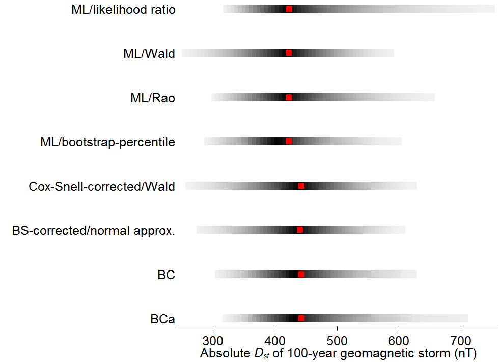
The graph just below shows answers to the first question using various methods that I tested, each row for a different method. The rows are labeled with the method names, but it’s not important here to know exactly what they mean. The red dots are estimates of once-a-century storm magnitude, like the 0.33% in my 2015 post. The grey bars are 95% confidence ranges.
The first three rows correspond to some classical methods: the likelihood ratio test of Samuel Wilks (1938); the Wald test, put forth by Abraham Wald in 1943; and the “score” or “Lagrange” test invented by living legend C.R. Rao in 1948. Within this initial triad, the likelihood ratio test is distinctly more cautionary, with its 95% confidence interval extending well above 700 nT.
The remaining five rows come from more modern methods, mostly “bootstrap” approaches developed by Bradley Efron. Most nudge the red point estimate to the right. All widen or narrow the confidence interval. The first of the five (“ML bootstrap/percentile”) comes closest to what I did for the 2015 post.1
What you can’t tell from the graph, but can tell from my new working paper, is that in the millions of artificial data sets I generated, the likelihood ratio test—the oldest of them all—worked best. The 95% confidence ranges that I constructed with it really did contain the size of the 100-year storm about 95% of the time. Most of the other methods’ so-called 95% confidence ranges contained the true value 85–90% of the time. The ranges were too small—overconfident, you could say. That leads me to believe that the most worrying confidence interval in the graph best captures the truth.
My finding in favor of the likelihood ratio is hardly revolutionary. In his excellent text on extreme value theory, Stuart Coles encourages researchers to infer using the likelihood ratio test. But he does not provide much justification. And I had not seen a thorough comparison of all the options new and old.
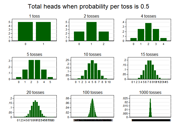
On reflection, I think I can explain why the likelihood ratio test works best (and, roughly, what it is). In my paper on the risk of geomagnetic storms, I introduced extreme value theory by counting heads and tails in coin tosses. In the chart below, the upper-left graph shows the probability distribution for the number of heads after one coin toss, which is 50% (or 0.5) for 0 heads and 50% for 1 head. After two tosses, the distribution runs 25%, 50%, 25% for 0, 1, and 2 heads. As we flip the coin more, the distribution converges in shape to the classic bell curve, which is, technically, the “normal” curve. A fact of paramount importance in statistics is that the normal curve almost always emerges in this way, no matter the distribution you start with–flipping coins, rolling dice, counting the visitors at an emergency room each night. Averages of any of these processes will be tend to be distributed according to a normal curve, if you collect data long enough. As a result, you can often do a lot in statistics, including forming confidence intervals, without knowing or having to make assumptions about the precise process that generates your data.
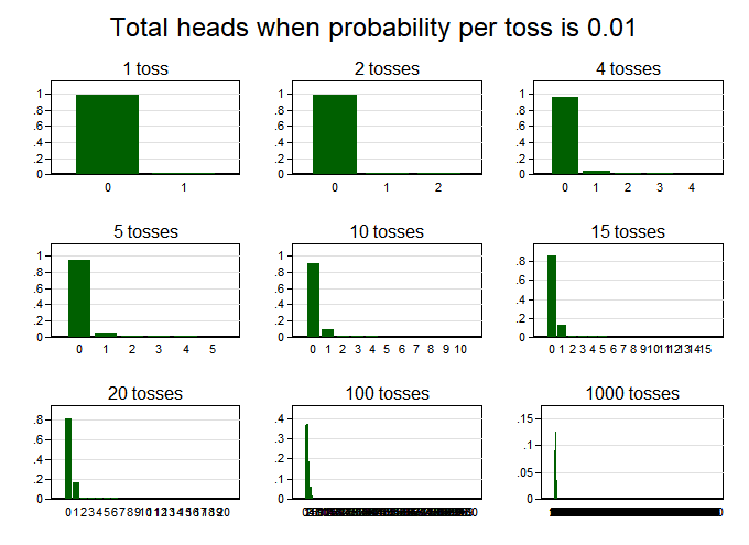
But there’s a catch when studying rare events: you have to collect a lot more data before your probability distribution starts to look normal. Suppose we are flipping an unfair coin, whose probability of coming up heads is just 1% (0.01). Then we get graphs like this for the number of heads:
Even after 100 tosses, the probability skews rightward, unlike a bell curve. The hump looks more symmetric after 1,000 tosses (despite being hard to discern because it’s so thin). Deep inside math, what I think is going on is that when the event of interest is rare—in this case, a head—the number of instances of that event rises much more slowly than the number of events, and that delays the emergence of the normal shape.
The lesson: When events of interest are rare and data sets are not large, statistical methods that assume that “normality” has set in can mislead. It is then better to explicitly compute the probability distribution that is likely at play, as I have done to make the graphs above. That is what the likelihood ratio test does, likelihood essentially being another word for probability. But the other two classical tests at the top of my first chart, the Wald and Rao, assume normality.
Moving from this example to geomagnetic storms requires two conceptual shifts, neither of which undoes the lesson. First, where the coin example starts by assuming the true frequency of the rare event, 1 out of 100, and then estimates the probabilities for various outcomes one might observe, such as two heads in 20 tosses, we start in empirical research with what is observed and then estimate the range of possibilities for the true frequency. Second, instead of computing averages, we compute the minimum size of a once-a-century storm. Its formulas is more complicated than the formula for the average, but both are statistics in the textbook sense: single numbers that capture some important aspect of a set of numbers.
The practical upshot for geomagnetic storms is that while the best estimate of the once-a-century storm size may be modest, just below 450, the range of plausible values can skew much higher, as shown in the likelihood ratio–based confidence interval at the top of my first graph.
Having gotten likelihood ratio religion, I turned to my second empirical question, about the chance per decade of another Carrington-strength storm (850 nanotesla). Revisiting the analysis in my 2015 post, I came to believe that my original statistical finding is too sanguine. I applied the “Cox-Snell” correction to my central estimate of the chance of anther Carrington, which raised it from 0.33% to 0.70% per decade. And where before my 95% confidence interval spanned from 0% to 4% per decade, the likelihood ratio test expanded the range from 0% all the way up to 11.6%, just shy of Riley’s commonly cited 12%.
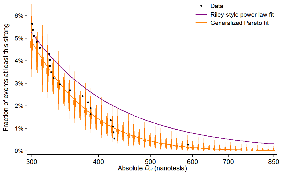
To link that finding to a key graph in my 2015 post, I need to rephrase it. I define a geomagnetic “event” as any time Dst spikes above 100. We’ve seen about 65 such events per decade since 1957, when the data begin. Dividing the bounds of the new confidence range, 0% and 11.6%/decade, by 65 gives me the confidence range for the chance that an event matches or surpasses Carrington: 0–0.2%. And that range is represented by the little orange half-diamond at the bottom right of this figure, which updates a similar graph in the 2015 post:
As in the earlier post, this graph shows the fraction of all events that we should expect to exceed various Dst thresholds, including 850, the Carrington storm’s estimated level. The black data points represent actual storms, the rightmost being the storm of 1989. The purple line is for a power law fit, in imitation of Riley; it does not match the data points very well. The orange line uses a model from extreme value theory, which I favor, called the Generalized Pareto distribution. Unlike in 2015, the confidence intervals, represented with orange diamonds, are drawn using the likelihood ratio test.2 They stretch higher than in the old graph, warning of potentially higher recurrence rates for big storms.
This update leads me to put a higher probability on the recurrence of a Carrington-class storm this century. On its own though, it doesn’t cause much revision in my overall assessment of the risk of geomagnetic storms. It still seems an open question how much there is to fear from a storm twice as intense the 1989 one, which civilization shrugged off. And that question, along with others relevant to understanding the risk, still seems under-researched, especially when one considers the potential stakes. So I did not counsel doing nothing before, and I do not now.
Data and code for this post (requires Stata)


